
27.7.10
Tramlines 2010 (Saturday @ The Washington)
This weekend just passed was brilliant. Tramlines is the biggest free festival in Europe, and only in it's second year. It was a great honour to be able to partake in the Live Art days on saturday at the washington and sunday at Soyo. I thoroughly enjoyed myself and feel i really showed my versatility as an illustrator. This is the piece I created on the Saturday. A Marshmallow man, roasting a couple of humans. Sadistic...yes...but it's cool I think..?


9.7.10
DEP-TH

Vintage British
This is a small piece I did for a Regent Sounds Studio (London) t-shirt design that I didn't finish because I got swamped with my Academy work. I thought it was a nice little design and something I will adapt a bit further hopefully along a similar themed "London" piece when I get a little more time. Enjoy.


8.7.10
Be Nice When You Play With My Heart

4.7.10
Werewolf

This is a werewolf i've done for the o2 academy "halloween" themed night in November. I'm thinking of doing a small series of posters...probably 4 (werewolf, vampire, ghoul and headless horseman) and then a final poster (probably for the final outcome) incorporating all four on one poster. I think the arms need to be a tad longer on this though looking at the photo? I hope you like it because it's the first actual, non computer/photoshop/illustrator drawing i've done and i'm very impressed that i actually still know how to hold a pen. RELIEF.
BY THE WAY - The thing hanging in front of the pink silk screen print in the background is NOT a handback. It's my Olympus film SLR. OKAY?!
9.6.10
INSPIRATION (NEW)
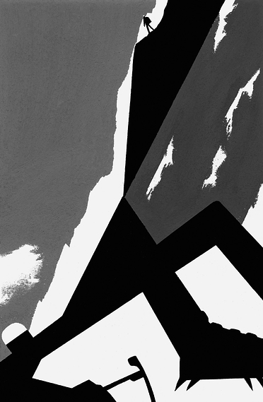
On browsing the D&AD website just a few moments ago, I became completely captivated by this illustration work by Geoff Grandfield. "Our brief was to make a contemporary set of monochrome illustrations and a two-colour cloth jacket design for the factual account of a legendary mountaineering accident."

I love the simplicity on these illustrations. Often when I am challenged with working in a limited number of colours (like the "End of the Line" brief). They represent the content well, as well as being just simple wonderful illustrations.


Illustrator: Geoff Grandfield
Art Director: Eleanor Crow
Design Director: Joe Whitlock-Blundell
Client: The Folio Society

I love the simplicity on these illustrations. Often when I am challenged with working in a limited number of colours (like the "End of the Line" brief). They represent the content well, as well as being just simple wonderful illustrations.


Illustrator: Geoff Grandfield
Art Director: Eleanor Crow
Design Director: Joe Whitlock-Blundell
Client: The Folio Society
8.6.10
Reimagining the Past
This is a wonderful video I have seen, as posted by Creators-UK on Twitter. Superb visual effects, brilliant score as well.

http://www.thecreatorsproject.com/blog/reimagining-the-past--2

3.6.10


UNBELIEVABLE
Jai Paul - BTSTU this is one of the best songs i've heard in absolutely ages. Since the global domination of The XX, this is really amazing!
Creative Spark - Arts Institute of Sheffield 2010
Naturally, studying at Sheffield Hallam (Arts Institute) and having some friends in the final year, it would have been rude of me not to hop along before work and check out their show. I'm extremely glad I did. Overall it was an excellent selection of work displayed, across all the disciplines, Illustration, Advertising, Motion, Hand Made and Identity.
I was a little dubious about it being held in the Hubs (our Graphics studio), but really, I felt it was a brilliant use of space. Enough room for a lot of people still with room for people to have a chat.
I thought the overall quality of student work was absolutely fantastic. I'd kind of half sat in on a few peoples tutorials with our tutor and been really excited about their ideas, though a couple of people hadn't really presented their work to what I had been expecting, though good nonetheless. I was already to say that the tutors have some responsibility for quality control (of the presentation of students work) though actually, in the third year, they should be well practiced and efficient at presenting their work. Although, maybe a subtle hint wouldn't have gone a miss, but then again, I know that i can rely on the opinions of my peers to provide me with decent feedback as to whether they think i'm doing something correctly. That's why I come into uni and work around them, and speak to them, and live with them. If it works, definitely don't try and fix it.
The signage for the show was brilliant. A massive well done to Chris, Andy and Ross for putting it together. Works very well and looks fantastic. Would've been nice if everyone could've come up with their own little logo for their artboards, but that's probably just creating extra work that they really don't need. Maybe I'll do it if i have time? Hmmm, food for thought.
I thought the overall quality of student work was absolutely fantastic. I'd kind of half sat in on a few peoples tutorials with our tutor and been really excited about their ideas, though a couple of people hadn't really presented their work to what I had been expecting, though good nonetheless. I was already to say that the tutors have some responsibility for quality control (of the presentation of students work) though actually, in the third year, they should be well practiced and efficient at presenting their work. Although, maybe a subtle hint wouldn't have gone a miss, but then again, I know that i can rely on the opinions of my peers to provide me with decent feedback as to whether they think i'm doing something correctly. That's why I come into uni and work around them, and speak to them, and live with them. If it works, definitely don't try and fix it.
The signage for the show was brilliant. A massive well done to Chris, Andy and Ross for putting it together. Works very well and looks fantastic. Would've been nice if everyone could've come up with their own little logo for their artboards, but that's probably just creating extra work that they really don't need. Maybe I'll do it if i have time? Hmmm, food for thought.
MOANS- I did feel that the lighting of the work was a bit lame. Just one light? It could've been put down to the students to provide some more lighting (something i'll be enquiring about for our final show next year)
That's about it for the moans really, It was a brilliant atmosphere, handled professionally and efficiently.
My best in show:
Andrew Lester - Brilliant screen prints and some fantastic illustration.
Jess Burton - Wonderful concept to her work and well thought out method to producing the final outcome. Really clever business card/packet also!
Alex Tizard and Jonathan Rands - Absolutely brilliant advertising concepts with some superbly produced final outcomes. Brilliant, tongue-in-cheek motion Lynx advert.
Fantastic show!
That's about it for the moans really, It was a brilliant atmosphere, handled professionally and efficiently.
My best in show:
Andrew Lester - Brilliant screen prints and some fantastic illustration.
Jess Burton - Wonderful concept to her work and well thought out method to producing the final outcome. Really clever business card/packet also!
Alex Tizard and Jonathan Rands - Absolutely brilliant advertising concepts with some superbly produced final outcomes. Brilliant, tongue-in-cheek motion Lynx advert.
Fantastic show!
20.5.10
A good telling off
I got CS5. I did this. Not finished. I feel looking at it now that it's a bit like the credit sequence of "Catch me if you can", which by the way is superb anyway. lovely.

16.5.10
AOI competition - Bike London
This is my only entry for the AOI Bike London Competition. Extremely pleased with the outcome. I hope I do ok!


14.5.10
More Moor Exhibitions
Once again some of my work has been put up in the Moor Artspace in Sheffield. Apologies for the terrible photo but i didn't have a camera only my worthless piece of poo phone. Oh well, still an achievement.


3.5.10
Coney Island Side Show - Final Linoleum Cut Prints.
FOR SH! AWARD JUDGING
At last. My final piece. Extremely proud with the final outcome of this and strangely fallen in love with the Bearded Lady. She's Beautiful. A long process has shown me benefits and drawbacks of lino printing, but ultimately i've worked out all the kinks and really started a journey with a process that i feel i've rea;;y begun to master and produce good work with. So yes, why delay any longer i hear you say? Enjoy this. All hand printed (minus the yellow insert which was digitally produced and laser printed) Run of 5 prints (around 19 indiviual prints per finished item!) Fully worth the effort, less the trapped nerve in my shoulder!


At last. My final piece. Extremely proud with the final outcome of this and strangely fallen in love with the Bearded Lady. She's Beautiful. A long process has shown me benefits and drawbacks of lino printing, but ultimately i've worked out all the kinks and really started a journey with a process that i feel i've rea;;y begun to master and produce good work with. So yes, why delay any longer i hear you say? Enjoy this. All hand printed (minus the yellow insert which was digitally produced and laser printed) Run of 5 prints (around 19 indiviual prints per finished item!) Fully worth the effort, less the trapped nerve in my shoulder!
Front Cover. I went with a red, white and blue theme because of the colours of America. Simple and ledgible I feel this really works. Wish the type would've printed better on numbers 3-5 in the series but the first two were used for my portfolio and are in fact at university waiting to be handed in. I think it was due to using Rough Watercolour paper that has a very grainy surface. I will use a smoother rough paper next time. "Learn wisdom from the follies of others" as some kind chap posted as a comment on the poster in the last post (still awaiting to see my errors pointed out...git)
This is the back of the Lino wrapping. The clours printed on the front have linked very nicely into introducing a sticker which binds the two edges together.
A close up on the sticker. Probably one of the more fiddly pieces I produced to print with.
Left is "The Bearded Lady, my evergrowing love, and on the right is "Cyclops". I tried to created characters based on past and current members of the actual Coney Island Side Show but I also wanted to put my own little spin on things to produce some original characters. I'm not an amazing character designer but I am very pleased with the cast of my Side Show.
Right is "The Almight Blob", a kind of dig to out American counter parts and also just had a brilliant time drawing him up. I love the nature of Lino Cuts and inparticular how he has a kind of glow coming from his left Moob. Right is the "Fire Breather", the lino I most impressed myself with.
When tasking myself with producing a colour and black and white poster, I naturally approached the colour poster first, knowing I would be able to produce something very visually exciting. This was me subconciously delaying the undertaking of the black and white poster. I struggled with this greatly, more than anything I was required to do for this Self Directed brief. I can't even explain why. However, I soon realised that it was a tad unnecessary, and began to think more on promotional lines as if the Side Show was going to come to Sheffield. I thought a flyer, to be inserted into my lino cut piece would be a good idea if were to ever happen. After trying to print on a numbers of different colours, the yellow really stood out as something that would not be easily ignored. I am geuinely very pleased with my work as well as myself and will continute to print on a regular basis. I hope everyone enjoys it too.
27.4.10
The Coney Island Project. Colour Poster
FOR SH! AWARD JUDGING
So, I've been a bit quiet lately. I don't even know why. Anyway, I've been burrowing myself away with a current project, based on the Coney Island Side Show in New York after visiting in March. After a fantastic trip, completely overwhelming and breathtaking, I've taking on this project, producing Lino cut prints into a "theatre style" concertina folded final piece. It will be a run of five, consisting of the concertina with a wrapped outer. Also, I will be producing a black and white, and colour poster advertising the show as if it were coming to Sheffield. The Lino's are cut and ready to print next week, the black and white poster is in conception and the colour poster is right before your eyes. Enjoy!

So, I've been a bit quiet lately. I don't even know why. Anyway, I've been burrowing myself away with a current project, based on the Coney Island Side Show in New York after visiting in March. After a fantastic trip, completely overwhelming and breathtaking, I've taking on this project, producing Lino cut prints into a "theatre style" concertina folded final piece. It will be a run of five, consisting of the concertina with a wrapped outer. Also, I will be producing a black and white, and colour poster advertising the show as if it were coming to Sheffield. The Lino's are cut and ready to print next week, the black and white poster is in conception and the colour poster is right before your eyes. Enjoy!
24.3.10
William Kentridge

Ranging from pure observation to twisted and dream like, evaded of reality, his work encompasses a huge selection of communicative elements even including motion work. If I am 10% of the designer William Kentridge is I will be happy. Though in my nature, I will not be satisfied until I can communicate as fluently and effectively as Kentridge does in his work. Purely incredible is a far short a statement from the beauty his work achieves.
GrassFace

I decided, as I like the calmness of drawing a large page of grass, like the couple I had done before, to produce another A3 sized piece, but this time drawing in a couple of hidden objects. Lego 2x2, Army man and Toy Car.
23.3.10
I'm Here by Spike Jonze
http://www.imheremovie.com/#

This is a wonderful little short film about love by Spike Jonze. I found out about this through being on the Ghostpatrol mailing list, proving that mailing lists aren't just for hte purpose of filling your inbox with useless drivel and junk mail about viagra and all things perverted. Well worth a look. (WARNING - you may have a wait a little while to watch this as the "seats" in this online "cinema" seem to fill up quite quickly!)
Enjoy

This is a wonderful little short film about love by Spike Jonze. I found out about this through being on the Ghostpatrol mailing list, proving that mailing lists aren't just for hte purpose of filling your inbox with useless drivel and junk mail about viagra and all things perverted. Well worth a look. (WARNING - you may have a wait a little while to watch this as the "seats" in this online "cinema" seem to fill up quite quickly!)
Enjoy
27.2.10
The End of the Line - Finished Book Cover

FOR SH! AWARD JUDGING
This is my final book cover for the "The end of the Line" brief. I very pleased with my final piece and really happy with my current aesthetic. I like it, I enjoy designing in this style and it really works for me. I hope you enjoy it too and that you are eager to see more work from me! Tell your friends.


 These are a few close ups of the Front, Spine and Back covers. I feel my final really flows nicely across the cover. One of the more challenging things was the actual design method. Instead of designing for a normal editorial or poster etc, a book cover needs to, in a sense, be designed backwards, due to the front cover being on the right hand side, when you'd normall start on the left. In effect, I was having to read my final piece right to left and back and front. Challenging but I really feel i've done myself proud. There were a few more changes to make but due to my ridiculous two week virus I was unable to tweak everything I wanted to.
2.1.10
Some Buildings

Subscribe to:
Posts (Atom)