
2.4.11
TEUMESSIAN FOX - Small Lino
First run of small lino for one of my greek beasts - the Teumessian Fox (3 Colour Lino - slightly smaller than A5)


16.3.11
WOOD CUT/CUT WOOD (and the occasional finger)
Wood cuts are now being produced for my greek mythology project. I felt it appropriate as the wood would lend itself nicely to providing a degree of authenticity, despite the greek myths...well, being myths. So far the process is going much quicker than I anticipated (which is a good thing that I am certainly not taking for granted) but quite painful as the occasional accidental stab-myself-in-the-hand happens. Oops.


9.3.11
"Woodlands Series"
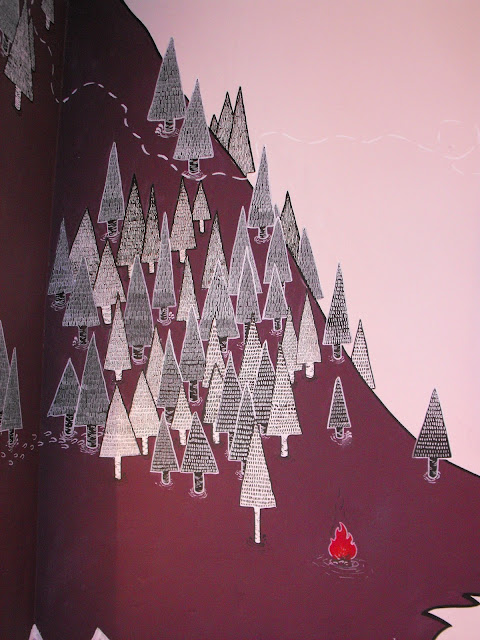
"Woodlands Series" is a 4 piece drawing I have done over the past day, incorporating some recent pattern work i've been experimenting with. All pieces are drawn onto some old rigid postal packet. Being a hoarder pays off sometimes...


4.3.11
You're my boy, Blue! (Sean Gee)
Sick new work from my house mate Sean Gee (CLICK HIS NAME FOR MORE - He's better than you, and I know it)


26.2.11
T-SHIRTS: KUJI SHOP
I was asked to do three t-shirt designs for one of Sheffield best Independent retailers; KUJI SHOP
Here are the final printed t-shirts, available to buy online or in store on Ecclesall Road soon! x


Here are the final printed t-shirts, available to buy online or in store on Ecclesall Road soon! x


20.2.11
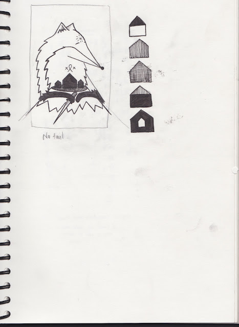
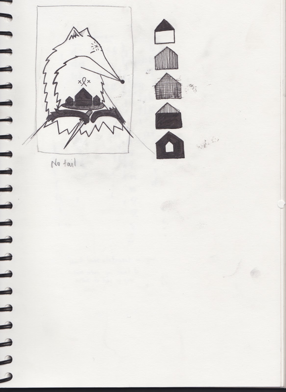
Mr Scruffs (ROUGHS) - Teumessian Fox
For one of my final projects of my final year of my degree in illustration (bricking it) I've chosen to illustrate some of the lesser known Greek Beasts of forgotten (or at least not often remembered) myths. I've long been fascinated by the classic tales and enthralling stories and only on further looking into the area did I find even richer and exciting stories that seemingly have been forgotten or cast aside by other popular stories. The vast majority of people will have heard of Minotaurs, Centaurs and the Kraken. But ask an every day person if they've heard of a Teumessian Fox or a Ceryneian Hind and you'd most likely receive a look befitting that of a mental patient.
I will be selecting 3 - 5 beasts and illustrate them in hoping they highlight the richness and excitement I got when reading their stories.
For now, enjoy these...x
TEUMESSIAN FOX ROUGHS


I will be selecting 3 - 5 beasts and illustrate them in hoping they highlight the richness and excitement I got when reading their stories.
For now, enjoy these...x
TEUMESSIAN FOX ROUGHS


14.2.11
British Identity Crisis - Editorial Brief
So, we're extremely lucky to have Lynne Chapman teaching some of us this last term and a bit and she briefed us last thursday with another Radio Times brief and a shorter space of time than the last brief Frazer set. This is been a great exercise and much to my surprise it's helped me way more than I thought it would have and I've actually really enjoyed it/now reconsidering my self directed briefs. Initially set to help us with our rough sketching and thumbnail ideas, it's turned into a piece that i'm actually really proud of.
My working quote from the text given: "We ask if Britain is having an identity crisis and, if so, whether it should give any cause for concern."


My working quote from the text given: "We ask if Britain is having an identity crisis and, if so, whether it should give any cause for concern."
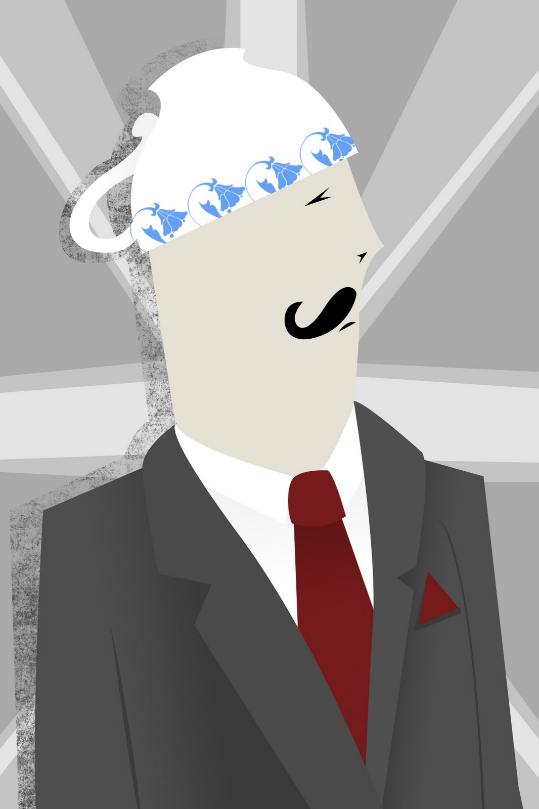
The idea of a traditional English Gentleman, made obvious by his suit and moustache being confused and using a traditional english Tea cup instead of the normal bowler hat. I liked playing with the sense of humour which doesn't often come into my work. I am extremely pleased with the rate of turn around of this piece and the quality of finishing.
Here is a piece that i tried, but didn't work quite as well as I hoped. Similar idea, just a different layout.

8.2.11
Alzheimer's Editorial Brief - Radio 4 (Uni)
My final piece for a University set brief.
"The Olfactory senses in the nose can evoke memories by associating them with smells"
The idea behind my work comes from the phrase "An elephant never forgets" and utilising the trunk as an image to link memory to the nose. It is slightly more conceptual that I usually work, though not the strongest piece of conceptual work I could have produced. I feel it still works well as an editorial piece as the elephant trunk is quickly identifiable and with the heading linking to "Memories" or "Alzheimer's Disease" works well with the text.

"The Olfactory senses in the nose can evoke memories by associating them with smells"
The idea behind my work comes from the phrase "An elephant never forgets" and utilising the trunk as an image to link memory to the nose. It is slightly more conceptual that I usually work, though not the strongest piece of conceptual work I could have produced. I feel it still works well as an editorial piece as the elephant trunk is quickly identifiable and with the heading linking to "Memories" or "Alzheimer's Disease" works well with the text.

28.1.11
Illustration Rally - Rotherham Exhibition Feature for Stars In Stripes
The wonderful Natsuki of Illustration Rally was lovely enough to post about our event last night. Big Props to all those who came it was a lovely evening!
Illustration Rally
x
Illustration Rally
x
24.1.11
Don't Panic Feature for Rotherham Exhibition
Whoooooo, Stars in Stripes Rotherham Exhibition has gained a little feature on Sheffield's Don't Panic.
Lovely Jovely.
Exhibition opening is this Thursday by the way, get yourselves down!
Link to the review HERE
x
Lovely Jovely.
Exhibition opening is this Thursday by the way, get yourselves down!
Link to the review HERE
x
22.1.11
Joseph Feather - Motion Graphics
I've just watch a really great video produced by a friend on the same course at University studying Motion Graphics. Fantastically simple but direct use of motion type. Well worth a watch.
Level 6 Graphic Design - Competitive Design Brief - 'Fakery' from Joseph Feather on Vimeo.
20.1.11
KUJI SHOP - FINAL PHOTOS!
My apologies for the delay, with dissertation and lack of camera i've not had any final photos.
Here they are, my first solo wall mural!
Hoorah!
x




Here they are, my first solo wall mural!
Hoorah!
x


Greed Poster by Sean Gee


Photos by Greg Thomas
10.1.11
DONE
I have finally completed all my illustrations for The Outsider, House of Illustration competition. I have also redesigned my front cover, as the other was lacking and did not link well with the other illustrations.

Illustration 1. "All I could hear was the blood pounding in my ears. I stood there, motionless" Part 1. Chapter 3, page 33. (i've had to shorten this quote due to the requirements of the competition - my bad)

Illustration 2. "...a crime made worse than sordid by the fact they were dealing with a monster. A man without morals" Part 2, Chapter 3, pp 95-96

Illustration 3. "I am on your side. But you have no way of knowing it, because your heart is blind" Part 2, Chapter 5, Pg 120. (would just like to point out that, given the image used, I am not anti christianity, it is simply the character in the books rejection of the chaplains wish for him to turn to God before his execution)

This is the folio binding. After completing the illustrations for inside the book I realised my cover wasn't totally befitting or just generally as good, so I came up with this idea, playing with the shadows i'd used within the other illustrations but focussing on the main event of the book, the killing on the beach.
This much more exciting image and one that i feel would really work to sell the book.
Well, fingers crossed they go down well but they are to be sent off immediately! Hooray! I'm going to go eat Chicken Casserole. WIN! x

Illustration 1. "All I could hear was the blood pounding in my ears. I stood there, motionless" Part 1. Chapter 3, page 33. (i've had to shorten this quote due to the requirements of the competition - my bad)

Illustration 2. "...a crime made worse than sordid by the fact they were dealing with a monster. A man without morals" Part 2, Chapter 3, pp 95-96

Illustration 3. "I am on your side. But you have no way of knowing it, because your heart is blind" Part 2, Chapter 5, Pg 120. (would just like to point out that, given the image used, I am not anti christianity, it is simply the character in the books rejection of the chaplains wish for him to turn to God before his execution)

This is the folio binding. After completing the illustrations for inside the book I realised my cover wasn't totally befitting or just generally as good, so I came up with this idea, playing with the shadows i'd used within the other illustrations but focussing on the main event of the book, the killing on the beach.
This much more exciting image and one that i feel would really work to sell the book.
Well, fingers crossed they go down well but they are to be sent off immediately! Hooray! I'm going to go eat Chicken Casserole. WIN! x
9.1.11
Illustration 3 - Finished
Third and final illustration for the house of illustration competition. Very pleased with my illustrations so far after my end of 2011 loss of drawing ability, things seem to be looking up.
The quote: "I am on your side, but you have no way of knowing it, because your heart is blind" - Part 2, Chapter 5, page 120
I've played with idea of a rejection of religion, Meursaults refusal to turn to god. This quote is said by the Chaplain, who is almost begging Meursault to see sense. I've brought in Meursault's attitude that seems to become more twisted as the book goes on. He is very much comfortable with the idea of death, the reason behind using the french word for death, on his wrist, playing with the idea that he is "wearing his heart on his sleeve". With his heart "blinded" and full of hate, "Mort" seems a very appropriate word to illustrate subtly into his skin, as it is apart of him.
Tomorrow I shall be redesigning my front cover with a simpler yet stronger image which i hope will work very well indeed.
Until then, Adieu x

The quote: "I am on your side, but you have no way of knowing it, because your heart is blind" - Part 2, Chapter 5, page 120
I've played with idea of a rejection of religion, Meursaults refusal to turn to god. This quote is said by the Chaplain, who is almost begging Meursault to see sense. I've brought in Meursault's attitude that seems to become more twisted as the book goes on. He is very much comfortable with the idea of death, the reason behind using the french word for death, on his wrist, playing with the idea that he is "wearing his heart on his sleeve". With his heart "blinded" and full of hate, "Mort" seems a very appropriate word to illustrate subtly into his skin, as it is apart of him.
Tomorrow I shall be redesigning my front cover with a simpler yet stronger image which i hope will work very well indeed.
Until then, Adieu x


The Outsider - Albert Camus (progress updates) #2
Another update of my work, please with my second illustration based on the quote...
"They [The Jury] had before them the basest of crimes, a crime made worse than sordid by the fact they were dealing with a monster, a man without morals" Part 2, Chapter 3, pp 95-96.

"They [The Jury] had before them the basest of crimes, a crime made worse than sordid by the fact they were dealing with a monster, a man without morals" Part 2, Chapter 3, pp 95-96.

The Arabic writing on the dock says "Monster". Across the skull that the shadow monster is holding (which represents the presence of death) there are french words for Death, Life and Blade.
The only thing left to do before finishing with textures and lighting is the character in the dock, which is the main character, whose shadow shows us the monster the Jury are really looking at.
x
6.1.11
Finished Illustration 1 - The Outsider Competition
"I left his room, closing the door behind me and paused for a minute in the dark, on the landing. The house was quiet, and a breath of dark, dank air wafted up from deep in the stairwell. All I could hear was the blood pounding in my ears. I stood there, motionless" Part 1. Chapter 3, page 33.


The Outsider - Albert Camus (progress updates)
So, I've been uncommonly quiet of late, which is completely down to how much my dissertation is killing me. Writing is not my strong point. However, I have been hammering away at the Folio Society Book Cover Redesign competition for The Outsider by Albert Camus.
Here's a couple of screen shots of the binding design and one of the 3 illustrations i've been doing for passages in the text. Only two more to go!

The Folio Binding - I've produced an aerial view of a town, with the buildings and back alleyways grounding the image to make the roads seem to rise above. This is because on reading the book and seeing that the main character, after committing a crime and being sentenced to death has an argument with a priest who says that the character should turn to God and he will be accepted into Heaven, yet the character refuses. I have tried to represent this as subtly as possible, with the Crucifix created out of the roads, and being upside down and set at an angle to show not only the characters rejection of religion but to show that faith in general is either lacking or is in question. The blood red type along the spine was a natural choice based on the motifs of the book.

Here's a couple of screen shots of the binding design and one of the 3 illustrations i've been doing for passages in the text. Only two more to go!

The Folio Binding - I've produced an aerial view of a town, with the buildings and back alleyways grounding the image to make the roads seem to rise above. This is because on reading the book and seeing that the main character, after committing a crime and being sentenced to death has an argument with a priest who says that the character should turn to God and he will be accepted into Heaven, yet the character refuses. I have tried to represent this as subtly as possible, with the Crucifix created out of the roads, and being upside down and set at an angle to show not only the characters rejection of religion but to show that faith in general is either lacking or is in question. The blood red type along the spine was a natural choice based on the motifs of the book.

The first of 3 Illustrations for the inside of the book, based on a passage of text.
"I left his room, closing the door behind me, and paused for a minute in the dark, on the landing. The house was quiet, and a breath of dark, dank air wafted p from deep in the stairwell. All I could hear was the blood pounding in my ears. I stood there, motionless." Part 1, Chapter 3, pg. 33
Missing from this is the character who will be standing to the right of the frame. I have used a lot of texture to highlight the sunlight and will play around with fading out the sunlight to give a bit more mood in the piece. I'm very happy with how both of my pieces have turned out so far, looking forward to getting the rest done!
x
30.12.10
Rotherham Art Space Update


Hello! Here's an update on the work I've been doing with the Stars In Stripes in Rotherham. I've been a bit quiet of late because we've been so busy cracking on. And Uni. And trying not to jump out of windows due to not wanting to do my Dissertation!
Hope you all had a wonderfully Cool Yule and have a great 2011!
x
Subscribe to:
Posts (Atom)